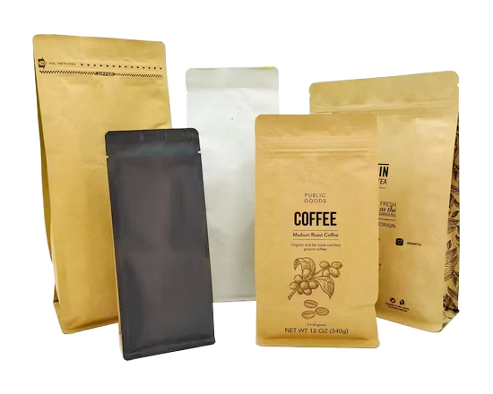
Matte and glossy finishes influence how customers view custom coffee packaging, how colors appear on shelves, and how brands communicate quality. Matte surfaces create a soft, premium feel with lower reflection, while glossy finishes provide stronger color brightness and easier cleaning. A 2023 packaging study with more than 1,000 consumers showed that surface texture affected product quality perception, and brands often select finishes based on target customers, retail environment, and design goals.
Coffee packaging is not only a container for roasted beans; it is also a communication tool that shapes the first impression before a customer tastes the product. The surface finish changes how the package looks under store lighting, how it feels in the hand, and how well printed elements stand out. In specialty coffee markets, where products often compete at prices above $15–30 per bag, packaging details can influence customer expectations before purchase.
“A matte finish usually creates a calm, handcrafted appearance, while a glossy finish creates a bright and energetic visual effect.”
The difference comes from how each surface handles light. Matte coatings scatter light across the package, reducing reflection and creating a smoother appearance. Glossy coatings reflect more light directly, making colors appear stronger and images look sharper. A printing comparison in 2022 showed that glossy surfaces could increase perceived color intensity by approximately 10–20% compared with similar matte surfaces under standard retail lighting.
This visual difference affects how brands present their coffee products. A company selling single-origin beans, organic coffee, or small-batch roasting products may choose matte packaging because the surface supports simple designs and natural colors. Brands selling flavored coffee, seasonal products, or supermarket coffee lines may prefer glossy packaging because bright graphics can attract attention from several meters away.
The choice of finish also changes the customer experience after the package is picked up. Matte surfaces usually feel softer and reduce visible fingerprints, which is useful for premium coffee products displayed in boutique stores. Glossy surfaces are smoother and easier to wipe clean, making them suitable for high-volume retail environments where packages may be handled by many customers.
A comparison of common characteristics:
| Feature | Matte Finish | Glossy Finish |
|---|---|---|
| Light reflection | Low reflection | High reflection |
| Color appearance | Soft and balanced | Bright and vivid |
| Fingerprint visibility | Lower | Higher |
| Surface feeling | Smooth, soft touch | Sleek and polished |
| Common usage | Specialty coffee, premium blends | Retail coffee, promotional packaging |
Because the surface changes customer perception, brands often connect the finish with their overall market position. This leads to another consideration: how the finish supports printing quality and design flexibility.
Matte coffee packaging works well with minimalist layouts, large typography, and natural color palettes. Black, beige, dark green, and earthy tones often appear more refined on matte surfaces because the reduced reflection allows customers to focus on the design itself. Many specialty coffee brands use matte black bags with simple labels to communicate roasting style, origin information, and product quality.
Glossy packaging performs differently because the reflective layer increases contrast. Product photos, colorful illustrations, and metallic effects usually appear stronger on glossy materials. For coffee companies managing multiple product categories, glossy finishes can help customers quickly identify different flavors or roast levels.
The printing process also requires different production settings. Matte films may absorb more ink into the surface, requiring careful control of ink density and drying conditions. Glossy films provide a smoother printing base but can show scratches or surface marks more easily.
| Printing factor | Matte surface | Glossy surface |
|---|---|---|
| Image sharpness | Good for simple designs | Excellent for detailed graphics |
| Color saturation | Moderate | Higher |
| Metallic effects | Limited | Stronger |
| Scratch appearance | Less noticeable | More noticeable |
The packaging structure behind the finish remains important because roasted coffee is sensitive to oxygen, moisture, and light. Research on roasted coffee storage has shown that aroma compounds gradually decrease after roasting, with oxygen exposure being one of the main factors affecting freshness. A surface coating improves appearance and handling but does not replace high-barrier materials, proper sealing, or degassing systems.
For brands developing personalized coffee packaging, the finish selection is usually combined with bag structure, valve design, printing method, and customer preferences. A premium coffee bag may use a matte outer layer with a strong barrier film inside, while a retail coffee bag may combine a glossy surface with colorful graphics and durable materials.
Consumer expectations around sustainability also influence finish selection. Matte packaging is often associated with environmentally friendly products because many sustainable brands use natural textures and simple designs. However, the finish itself does not determine whether a package is environmentally responsible. Material type, recyclability, production process, and package weight have a larger influence.
A 2021 international consumer survey covering thousands of participants found that packaging sustainability information affected food and beverage purchasing preferences. Brands therefore need to consider both appearance and material performance when selecting coffee packaging finishes.
“A matte appearance may suggest natural positioning, but sustainable packaging depends on the materials behind the surface.”
Hybrid finishing has become more common because it combines the advantages of both options. Some coffee bags use a matte background with glossy printed logos, patterns, or product information. This approach creates contrast while maintaining a premium appearance.
Examples of finish combinations:
| Brand style | Recommended finish approach |
|---|---|
| Specialty single-origin coffee | Matte surface with simple graphics |
| Everyday supermarket coffee | Glossy surface with strong colors |
| Gift coffee sets | Matte base with glossy highlights |
| Modern premium blends | Soft-touch matte with detailed printing |
Retail location also affects the best choice. Coffee sold online relies heavily on product images, so glossy finishes may appear more attractive in digital photos because of stronger color contrast. Coffee displayed in physical stores may benefit from matte textures because customers can directly feel the packaging.
In 2024, the global specialty coffee market continued expanding, increasing competition among independent roasters and larger brands. Packaging finishes became one part of product differentiation because many coffee bags share similar sizes, shapes, and materials. A carefully selected surface helps products communicate their style before customers read detailed information.
The decision between matte and glossy packaging depends on the product type, customer group, design style, and sales environment. Matte finishes provide a softer appearance and stronger tactile experience, while glossy finishes offer brighter graphics and easier maintenance.
The best coffee packaging finish is the one that matches the brand message while maintaining practical performance. A successful package combines surface design with barrier protection, printing quality, and convenient handling to keep coffee fresh and present the product clearly.